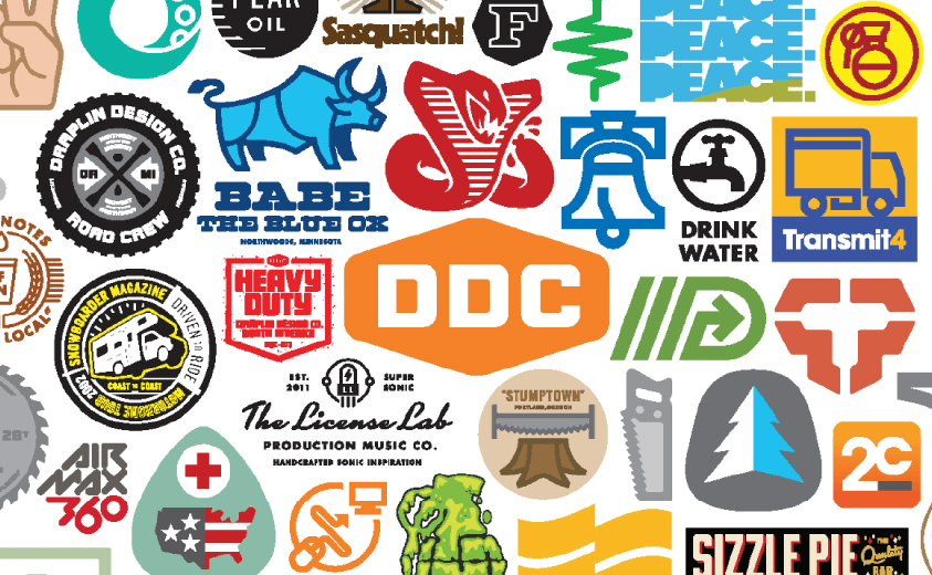
Last May, I went to Atlanta to the HOW Design Live conference. One of the more exciting speakers was Aaron Draplin. I wasn’t familiar with his work before but now I see it everywhere. I also heard him on Marc Maron’s WTF podcast which is pretty good. Anyways, I love how he takes inspiration from design from the 50s and 60s. I think on the podcast he says his favorite logo is the Bicentennial logo.

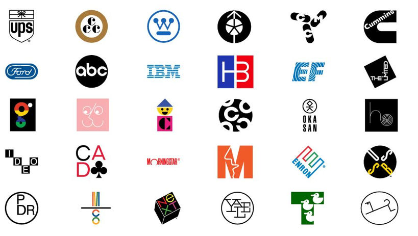
I need to think more about using negative space and solid blocks of color. It’s refreshing to see designs from the 60s, and it’s nice to see logos that don’t have gradients and other weird stuff going on. Simple is better and more difficult to execute. I love Paul Rand’s work. His work is so fun and playful and thoughtful and cool.
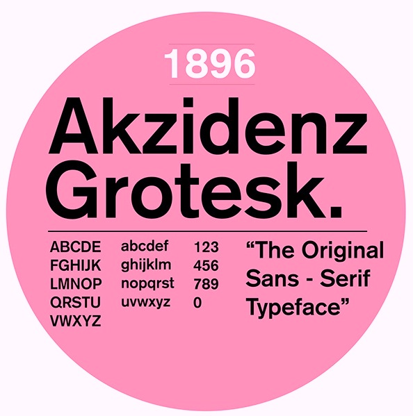
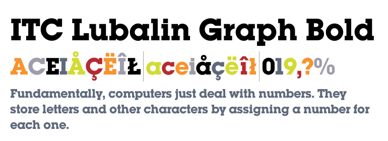
One of my favorite typefaces is Akzidenz Grotesk. It makes everything instantly more hip and retro in a cool way. It’s quirkier than Helvetica. I watched a lynda.com video, where Draplin uses Akzidenz Grotesk to design some sample logos. Looked so cool. He also uses Lubalin for his own branding.
Also this is unrelated to anything else, but I am really obsessed with DIN typeface at the moment. It makes everything look like a contemporary art gallery.
